

Introduction
Most digital products don't fail because the idea was bad. They fail because the outcome was vague, the page was weak, or nobody checked whether people actually wanted it in the first place. A beautifully designed planner or template pack can still sit unsold if a buyer can't tell in five seconds what it does for them.
🎥 Prefer watching instead of reading?
Watch the full step-by-step explainer video below.
This guide breaks down exactly what separates a digital product that converts from one that gets scrolled past — covering strategy, page design, user experience, and the funnel that surrounds it. If you're building your own digital products from scratch or working with PLR products to resell, the same principles apply.
So what does "high-converting" actually mean here? It's not just about traffic or clicks — it's about the percentage of visitors who see your product and decide, with confidence, to buy it. That confidence is built through clarity, trust, and design that removes friction at every step. Get those three things right, and conversion follows.
Section 1: Get the Product Strategy Right (Before You Design Anything)
Before a single mockup or template layout gets created, the most important work happens on paper: knowing exactly who you're designing for and what result they're paying for.
1. Start With a Clear, Specific Outcome
High-converting digital products solve one specific problem for one specific person — not a vague, everyone-could-use-this promise. The clearer the outcome, the easier the product is to design, describe, and sell.
A simple formula to work from:
Specific Person + Specific Problem + Clear Outcome = A Product That Sells
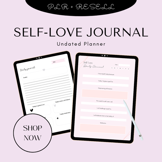
For example, "a self-love journal" is a product description. "A guided journal that helps someone rebuild their confidence in 30 days through daily prompts" is a promise — and it's exactly why resources like the self-love journal resonate: the outcome is baked into the concept from the start. The same logic applies to planners — a well-scoped planner succeeds because it promises a specific kind of organization, not organization in general.
Ask yourself before designing anything:
-
Who exactly is this for?
-
What specific problem do they have right now?
-
What result will they walk away with?
This focus doesn't just make the product better — it makes every downstream decision easier, from cover design to sales copy.
2. Validate Demand Before You Design
Don't design in a vacuum. Before investing hours into layout and polish, validate that people actually want the product.
Practical ways to test demand:
-
Look at your most-saved content, most-asked questions, or top-performing posts for recurring themes
-
Build a simple landing page with an email sign-up to gauge interest before the product exists
-
Use polls, DMs, or a small pre-launch list to see what people are actually willing to pay for
This is especially useful if you're deciding between building from scratch or sourcing PLR products to resell — demand signals tell you which niche or format is worth your design time before you commit to it. If you're newer to this model entirely, a resource like how to sell your digital products online walks through the full process end to end, from validation through to your first sale.
Fast validation consistently beats perfect design when you're just starting out — a rough product that's confirmed to be wanted will outsell a polished one nobody asked for.
3. Build Product Families, Not One-Offs
Top-performing digital sellers rarely rely on a single standalone product. Instead, they build product families: one strong "master" design or core asset, duplicated and varied — different colors, themes, or niches — to create a full collection that feels cohesive rather than repetitive.
This approach works because it:
-
Increases perceived value (a collection feels more substantial than a single file)
-
Opens up natural cross-sell and upsell opportunities
-
Lets you move faster, since you're adapting a proven format rather than starting from zero each time
You can see this pattern clearly in curated collections like Plan & Prosper or the Planner Collection, where a consistent design language ties multiple products together into one recognizable line. The same applies to niche-specific ranges like AI prompt packs or bundled seasonal offers such as the New Year New Me Collection — each is really a family of related products built from a shared core concept, not fifteen unrelated ideas competing for attention.
If you want a deeper breakdown of which product types are performing well right now, the best PLR products to resell in 2026 is a useful starting point for choosing your first (or next) product family.
Section 2: Design a Page That Converts
Once the product itself is built around a clear outcome, the next battleground is the page that sells it. This is where most digital products actually win or lose the sale — often before a visitor scrolls past the first screen.
4. Answer 5 Key Questions in 10 Seconds
Visitors don't read product pages line by line on their first pass — they scan, and they're subconsciously looking for answers to five questions:
-
What is this?
-
Who is it for?
-
What does it cost?
-
Why should I trust the seller?
-
What happens when I click "Buy"?
If your page doesn't answer these within the first few seconds, most visitors simply leave. This is especially true for broad, high-competition categories — if you're selling into a crowded space like the ones covered in 100 digital products you can sell online in 2026, clarity is often the single biggest differentiator between your listing and a dozen similar ones.
Design the top of your page around these five answers before worrying about anything else — polish only matters once clarity is in place.
5. Optimize the Hero Section
Your hero section — the very top of the page — is the most valuable real estate you have. Eye-tracking research consistently shows users scan pages in an F-pattern, reading left to right across the top, then down the left edge. That means your most persuasive information needs to live in the upper portion of the page, not buried below the fold.
A strong hero section includes:
-
A sharp, benefit-led headline (not a feature name)
-
A short supporting line that clarifies the outcome
-
A real preview or mockup of the product — not a generic icon or placeholder
-
A clearly visible CTA button with the price shown, not hidden behind a click
This principle scales differently depending on the product. A single downloadable guide, like the Anti-Algorithm Growth Guide, needs a hero built around one strong promise. A larger bundle, like The Content Girl Collection, needs a hero that signals breadth and value at a glance — multiple pieces, one cohesive offer.
6. Write Value-Based, Benefit-Led Descriptions
Feature dumps lose buyers. Descriptions that lead with outcomes keep them reading. Instead of listing specs, structure your copy around what the buyer actually gets to do or feel once they own the product.
Effective descriptions typically include:
-
3–5 benefit-led bullet points, not a wall of features
-
A clear "what's included" section listing exact files, templates, or modules
-
Scannable subheadings so visitors can jump to the part they care about
This matters most for products where buyers can't fully picture the contents up front — no-design options like the ones in 15 digital products you can sell on Etsy without designing, or AI-built products from guides like 40 digital products you can create using ChatGPT or AI tools, need extra clarity since the buyer has no prior reference point for what "AI prompt pack" or "ChatGPT template" actually delivers. Collections like AI prompt packs handle this well by spelling out contents explicitly rather than relying on the category name to do the explaining.
7. Use Price Anchoring and Clear Pricing
Pricing is arguably the single highest-impact — and easiest to test — element on your entire page.
A few conversion-tested pricing tactics:
-
Show the price immediately, without requiring a click or sign-up to reveal it
-
Use price anchoring (e.g., "Regular $49, today $19") to communicate value clearly
-
For bundles, show the combined individual value against the bundle price so the discount is obvious
This is particularly effective for premium, higher-ticket items where perceived value needs to be established clearly — something like The Ultimate Branding Course benefits from anchoring because the price needs to be justified against the depth of what's inside, not just displayed as a number. The same logic applies across structured collections like Masterclasses, where bundling naturally invites a value comparison.
8. Add Strong Social Proof Early
Social proof — reviews, testimonials, case studies — reduces the perceived risk of buying something intangible. Buyers of digital products can't fully evaluate quality before purchase, so trust signals have to do that work instead.
Best practices:
-
Place a specific testimonial or result within the first scroll, right after the initial description
-
Use real quotes with names or photos wherever possible, rather than vague, unattributed praise
-
Test positioning — some pages convert better with testimonials above the description, others below it
This is especially valuable in trust-sensitive niches. If you're exploring high-demand niches for PLR digital products that sell fast, or building toward financial freedom through side hustles content, buyers are often making a judgment call about a stranger's expertise — social proof is what tips that judgment in your favor.

9. Use High-Quality, Strategic Mockups and Images
For digital products, imagery does the job that touch and physical inspection would do for a physical item — it's the closest thing to "trying before buying."
To get this right:
-
Lead with a strong, legible thumbnail — critical for marketplaces like Etsy where thumbnails are the first (and sometimes only) impression
-
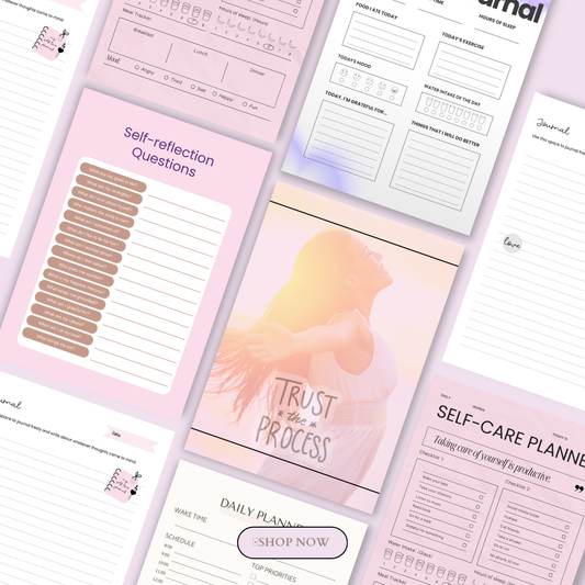
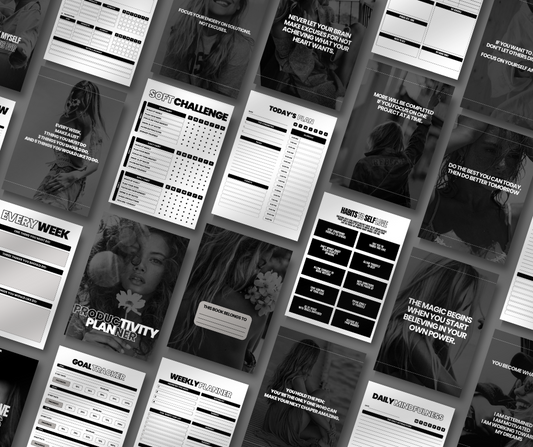
Show multiple angles: a flat lay of full contents, a close-up of a standout detail, and the product in a real-world setting
-
Include at least one lifestyle shot — the product in use, not just displayed
-
Add light informational overlays where they clarify value (e.g., "40 editable templates")
-
Use descriptive filenames and SEO-friendly alt text on every image
Visually rich niches make this non-negotiable. Bundles like the Midjourney Mastery Guide Collection or content packs like Glossed in Power live or die on how well their previews communicate visual quality before purchase. Curated visual collections such as the AI Image Collection, Reel Power Packs, and Post Perfection all lean on this same principle — the preview images essentially are the sales pitch.
If you'd rather source proven, ready-to-sell products instead of designing pages from scratch, done-for-you digital products that actually sell is worth a look — and once you're selling, pairing strong page design with a solid fulfillment setup, like the guidance in the best way to deliver digital products to customers automatically, rounds out the buying experience end to end.
Section 3: UX, Speed, and Friction Reduction
Even the most compelling product page can lose the sale if the experience around it is clunky. This section is about removing every small obstacle between "interested" and "purchased."
10. Reduce Friction in the Buying Process
Every extra step, unnecessary field, or confusing click costs you conversions. Buyers of digital products expect instant gratification — that's part of the appeal — so anything that slows them down works against you.
To reduce friction:
-
Cut form fields down to the essentials — name and email is often enough
-
Offer guest checkout wherever possible, rather than forcing account creation
-
Keep navigation simple and intuitive so buyers never have to hunt for what they need
This matters even more for niche or B2B-facing offers, where the buyer may be evaluating on behalf of a business. If you're building digital products for small business owners, or targeting a specific service niche like digital downloads for wedding planners, a frictionless checkout signals professionalism just as much as the product design does. And once someone does buy, automating digital product delivery keeps that same low-friction experience going after checkout — instant access, no manual follow-up required.
11. Optimize Page Speed and Mobile Experience
A large share of digital product discovery — especially through social media — now happens on a phone. If your page isn't fast and mobile-friendly, you're losing sales before visitors even see the product.
Practical steps:
-
Compress images and use modern formats like WebP
-
Lazy-load anything below the fold so the initial page loads instantly
-
Aim for under 3 seconds load time on real mobile devices, not just desktop previews
This is non-negotiable if your traffic comes from platforms covered in guides like how to market digital products on social media — a visitor tapping through from Instagram or TikTok has almost no patience for a slow-loading page and will bounce within seconds if it stalls.
12. Use Design Psychology to Guide Attention
Strategic design choices quietly guide buyer behavior without them even noticing it's happening. This is where conversion becomes less about what you say and more about how the page is visually structured.
Key principles:
-
Visual clarity — clean layouts and clear hierarchy reduce hesitation
-
Consistent patterns — familiar design elements lower cognitive friction
-
White space — used deliberately, it draws the eye toward the CTA and price
-
Color psychology — color choices should reinforce trust and highlight action
-
Contrasting CTA buttons — the "Buy" button should visually stand out from everything around it
Aesthetic-driven products benefit enormously from getting this right. A polished, cohesive collection like The Glow Lab Co. Skincare Collection needs a page design that matches the luxury feel of the product itself — mismatched design psychology undercuts the premium positioning instantly.
13. Add an FAQ That Handles Real Objections
A well-built FAQ section quietly removes last-minute doubts that would otherwise stop someone from clicking "buy" — and it reduces post-purchase support requests too.
Build it from real questions:
-
Pull directly from actual customer emails, comments, or DMs
-
Address common objections: "Is this beginner-friendly?", "What format is this in?", "Do I need any other tools?", "What's your refund policy?"
-
Treat the FAQ as testable content — swap questions over time to see which ones move conversion
This is especially useful for products with a learning curve, like structured online masterclasses, where buyers often hesitate simply because they're unsure what the learning experience will actually involve.
Section 4: Build the Funnel Around the Product
14. Create a Simple Sales Funnel
High-converting digital products rarely rely on a single standalone page — they sit inside a simple, repeatable funnel that warms visitors up before asking for the sale.
A basic, effective funnel structure:
-
Lead magnet — a free resource that attracts your audience and captures emails
-
Email nurture — a short sequence that builds trust and demonstrates expertise
-
Tripwire offer — a low-priced product ($5–$15) that turns subscribers into buyers
-
Core product — your main offer at full price
-
Upsells/cross-sells — related products offered to existing buyers
This structure works particularly well with content-driven product lines, where a smaller entry point naturally leads into a bigger purchase. A pack like Glossed in Power could serve as a tripwire that leads into a larger bundle like The Content Girl Collection as the core offer. Once the funnel is built, tying it to reliable fulfillment — as outlined in the best way to deliver digital products to customers automatically — makes sure every stage, from tripwire to upsell, delivers instantly and keeps the experience frictionless end to end.
Section 5: Test and Improve Over Time
15. Use CRO Best Practices: Research, Hypotheses, Testing
Even strong design instincts benefit from evidence. Conversion rate optimization (CRO) is less about guessing and more about a repeatable cycle of research, testing, and refinement — and according to ContentSquare's CRO best practices, the process is roughly 80% research and only 20% experimentation.
The basic cycle looks like this:
-
Audit and research — use analytics, heatmaps, and session recordings to find where visitors drop off
-
Form a hypothesis — for example, "moving testimonials above the fold will increase add-to-cart rate"
-
A/B test — run version A against version B and measure the actual result
-
Analyze and iterate — keep what wins, and use the insight to design smarter tests next time
Start with the highest-impact elements first: your price, your hero section, where social proof sits, and your FAQ content. Resources like SendOwl's guide to digital product page conversion design and Digital Applied's product page optimization guide both point to the same pattern — small, targeted changes to these elements tend to move conversion far more than a full redesign. Kit's breakdown of high-converting landing page examples is also worth studying if you want to see these principles applied across a range of real pages before running your own tests.
This applies just as much to individual products as it does to full collections — testing a single high-detail listing like Content Girl Images: 100 Premium Aesthetic Images can reveal insights (which mockup style converts, which price point anchors best) that you can then apply across your entire catalog.
Conclusion
High-converting digital products aren't built through one big decision — they're built through a chain of smaller ones, each reinforcing the last:
Strategy (a clear outcome, validated demand, a product family) → Page design (a hero that answers the right questions, benefit-led copy, clear pricing, social proof, strong imagery) → UX and speed (low friction, fast load times, deliberate design psychology, a useful FAQ) → Funnel (lead magnet through to upsell) → Testing (a continuous cycle of research and refinement).
None of these steps needs to be complicated on its own. What makes the difference is consistency — applying the same care to every product in your catalog, whether that's a niche content pack like Positivity Pop, a done-for-you email sequence like Glow-Up Email Empire, or a visual bundle like the Skincare Mask & Scrub Collection. The same framework scales across niches — it applies just as well to digital products for photographers as it does to the broader landscape of digital products for content creators in 2026. For further reading on the fundamentals, MyDesigns' guide to creating digital products and Kittl's roundup of digital products to sell are both solid starting points.
Quick-Reference Checklist
-
Define a specific person, problem, and outcome before designing anything
-
Validate demand before committing design time
-
Build a product family, not a one-off
-
Make sure your page answers all 5 key questions in the first 10 seconds
-
Optimize your hero section for F-pattern scanning
-
Write benefit-led descriptions with a clear "what's included"
-
Anchor your pricing and keep it visible without a click
-
Place strong, specific social proof early on the page
-
Use high-quality mockups, lifestyle shots, and SEO alt text
-
Minimize friction in checkout and navigation
-
Optimize for mobile speed — under 3 seconds
-
Use white space, contrast, and color psychology to guide attention
-
Add a real, objection-handling FAQ
-
Build a simple funnel: lead magnet → nurture → tripwire → core product → upsell
-
Test continuously — audit, hypothesize, A/B test, iterate
Ready to put these principles into practice? Explore the full range of ready-to-sell templates, planners, and content bundles — including the complete All MRR Products collection, standout picks like the Midjourney Mastery Guide Collection and Content Girl Reels: 35 Viral-Ready AI Reels — by heading to Shop All.
FAQ: Designing High-Converting Digital Products
1. What makes a digital product "high-converting"?
A high-converting digital product is one where a clear, specific promise, a well-designed page, and a low-friction buying process work together to turn a high percentage of visitors into buyers. It's less about the product itself being flashy and more about how clearly it communicates its value and how easy it is to purchase.
2. Do I need design skills to create a high-converting digital product?
No. Strategy — a specific outcome for a specific person — matters more than design polish. Clean, simple layouts with clear hierarchy consistently outperform elaborate but confusing ones. Many sellers start with ready-made templates or PLR products and focus their effort on positioning, pricing, and page structure instead.
3. How important are mockups and images compared to the product itself?
Extremely important. Since buyers can't physically inspect a digital product before purchasing, your mockups and preview images are doing the job that touch and packaging would do for a physical item. A strong thumbnail, a real lifestyle shot, and a clear "what's included" visual often influence the buying decision more than the product description does.
4. What's the single highest-impact change I can make to an underperforming product page?
Pricing and hero section clarity tend to move the needle fastest. Making sure the price is visible without a click, the headline is benefit-led rather than feature-led, and the first screen answers "what is this, who's it for, and why should I trust you" usually produces a bigger lift than a full page redesign.
5. How do I know if my product page needs testing versus a bigger rework?
If your page already gets decent traffic but conversion stays flat, that's a signal for testing — small changes to price display, testimonial placement, or your CTA button. If traffic itself is low or bounce rate is very high, that usually points to a bigger issue with clarity, load speed, or mobile experience, which needs a structural fix rather than a small test.
🎬 Want a visual walkthrough?
If you’d rather watch than read, here’s the full explainer video covering everything in this guide: